80legs, the sister company to Datafiniti, is a web crawling and scraping service that allows its customers to pull data off of web sites. Common uses of the service are gathering competitive product pricing information, pulling ratings and reviews off sites for reputation management, and collecting names and contact information for sales leads. 80legs offers its customers the use of both an API and a web interface to configure and run web crawls.
My Role
My role on this project was as the team lead and UX designer. I led a small team of developers, using the Agile process. I also conducted user research with both external customers and internal stakeholders, and created a set of design deliverables (shown below).
Project Goals
Update the 80legs customer interface to improve ease of use and refresh the visual design. The new web user interface needed to allow users to:- Create new web crawls
- Rerun web crawls
- Track the progress of their web crawls
- Download the resulting data from their web crawls
- Review and update their account information
- Match the look and feel of the 80legs makreting web site
Research
My research began with talking to internal stakeholders from the sales, marketing, and customer support teams. Members of those teams were in positions that allowed them to interact with customers either directly or indirectly, and they had extensive knowledge about 80legs customers. They also had their own requirements for the product. In my meeting with internal stakeholders I documented the 80legs customer touchpoints and brainstormed ideas for new features.
I also conducted user interviews with 80legs customers, asking a variety of questions about what problems they were trying to solve with web data, what solutions had they tried, and what their pain points were. I also asked what they liked and disliked about the 80legs service, and what new features they would like to see added.
Process Flow Charts
I created a customer touchpoint map, based on my meetings with sales, marketing, and customer support. This helped me understand how potential users became 80legs customers and interacted with the company. I also documented the existing interface as a flow diagram and updated it to match the improvements I had planned.
Wireframes
I created a set of wireframes using Balsamiq to flesh out the ideas I had gathered from customers, stakeholders, and my own brainstorming. The existing 80legs interface for creating a web crawl listed all the options on a single screen. Although some users liked having all the options on one screen, others thought it was confusing and too complicated. I broke the process of creating a crawl into three steps, with the option to view all the steps at once. I also added more inline help text, which could be hidden by more experienced users. Another addition was a dashboard where users could easily check the status of their crawls. To allow users to quickly find and manage items like crawls and URL lists, I added searching, sorting, and filtering to the lists in the UI.
Finished Mock-ups - Desktop Layout
I jumped from the wireframing stage directly to the HTML prototype stage. Using the Bootstrap HTML framework, I put together a basic prototype to be reviewed with internal stakeholders. The visual design was also created using HTML and CSS. I borrowed some design elements from the 80legs marketing site to maintain the brand. The link colors, the shade of blue in the header, and some of the button styles were taken from the marketing site.
Finished Mock-ups - Mobile Layout
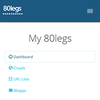
Using Google Analytics, I determined that the vast majority of 80legs users were using desktop or laptop computers. This was not surprising, given the complexity of creating and running web crawls. But there was a small percentage that used mobile devices, and there's always a chance that percentage could grow. Also, as a matter of best practice, I design sites to be responsive. Shown here is the 80legs interface when viewed on a device with a small screen.


