I built (vibecoded?) this app using Replit, you can take a look at: AreThereCookies.com
This was a side project that I worked on before and during COVID. How would you know if the restaurant, food trailer, or bakery you're going to hasn't already sold out of what you want? If only there were an app that could tell you. After not being able to buy Big John chocolate chip cookies at Whole Foods several times, due to them being sold out, I decided this was a problem that needed to be solved. I also began to think about how inventory affected the customer experience, not just with Whole Foods and cookies, but with a variety of consumables. An idea took form: a mobile app where customers, business owners, or both could list what a business has and how much of it they have left.
My Role
My role in this project is that of both product manager and designer. My responsibilities included user research, concepting the feature list, and creating the UI and visual design. My partner in this project handled the development of both the front and back end.
Project Goals
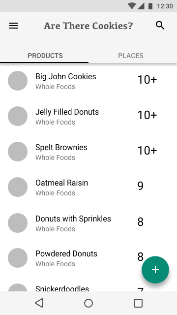
Produce a minimum viable product, put it out into the world, and get feedback. This app is geared towards a younger consumer audience. Product should allow users to:- Browse / search a list of food items based on their location
- View details about those food items, mainly the amount left at a specific place
- Update the amount left
- Browse / search a list of places nearby that have food items that the user is interested in
- View details about those places, such as address and food items available there
Research
My initial thought was that this could be useful for food trucks and their customers. Food trucks often deal with a very limited supply of what they serve, and they frequently sell out before their official closing time. I ran this idea by three food truck owners and got valuable feedback, mainly that they didn't think an app like this would be very useful. The owners themselves didn't think they would have time to update the quantities of their goods in an app and didn't necessarily trust their customers to update the quantities either. The business owners also thought they benefited from customers not knowing what they had in stock. Customers who visited their food trucks intending to buy one thing, would often buy something else if what they wanted was sold out. As a customer of these food trucks, I disagreed with that assessment. Knowing that a business is sold out of what I want saves me the disappointment of finding that out when I get there. These businesses may gain sales in the short term, but over the long term they will likely lose customers. We decided to move forward despite the feedback I received, and with the assumption that customers knowing what a business has in stock leads to a better customer experience.
Wireframes
I had started working with Adobe XD to create wireframes and design comps in my day job, so I also used that tool to create the wireframes for this project. I also investigated using other tools, such as Sketch and Figma. Shown here are my initial wireframes that I used to communicate my ideas to the developer I'm working with.
Finished Mock-ups
Working with Adobe Illustrator, I came up with a basic color scheme and logo for the app. I further refined the interface during visual design phase, incorporating feedback from the developer about technical limitations and edge cases. This app was developed using React Native, meaning one code base for both iOS and Android, which also meant the design would also be shared across platforms. I designed the app using UI patterns that were common to both Google's Material UI guidelines and Apple's interface guidelines for iOS, along with patterns that were agnostic.


