Datafiniti crawls the web and compiles it into a massive database. The data is then sold via a subscription service. At the start of this project, Datafiniti only offered its customers access to its data via an API. To expand the company's customer base, the CEO decided a less technical and more user-friendly interface was needed.
Uses for the data include:- Sales representatives looking for new sales leads
- E-commerce companies wanting competitive pricing information
- Product manufacturers wanting ratings and reviews of their products for reputation management
My Role
I was the sole UX designer at Dafafiniti. The company was small and I took on additional duties such as product management and acted as I team lead for the small team that develops Datafiniti's web-based products.
Project Goals
Research, design, and build a user interface to the Datafiniti database. The user interface should allow users to:- Search for several different types of data based on key criteria with minimal technical knowledge
- View sample data to verify that the data the users are purchasing matches their expectations
- Download the data files that are a result of their search
- Keep track of how many records they have purchased versus how many they have downloaded (credits purchased versus credits used)
Research
My research took the form of interviews but also included reviewing Datafiniti's competition. Datafiniti as a company was new at the start of this project and what few customers they had used an API to search and download data from the company’s database. These were technical users who had some programming ability. These customers were not the primary audience of the new user interface, but they could still provide valuable feedback. I also talked to a few potential customers, people who were in the market for the kind of data Datafiniti sold. I asked them about how they planned to use the data, what other data providers they had looked into, and what their ideal solution would be.
Key takeaways were that potential users wanted:- A simple interface, many of Datafinit’s competitors have interfaces that amount to a long and complicated form
- "Make it like Google", many interviewees said searching for company data should be as simple as searching the internet, ideally keyword based
- Be able to see and download results quickly
Wireframes
Each record in Datafiniti’s database has dozens of attributes that can be searched by. Showing all the attributes in the interface would have resulted in a long and complicated form (like Datafiniti’s competition). Using analytics run on API searches, I determined what the most searched-by attributes were for each data type, and used those as the interface's search criteria. I then created three interface designs based on the research I had gathered and reviewed them with the same group of people I had interviewed earlier.
Version 1
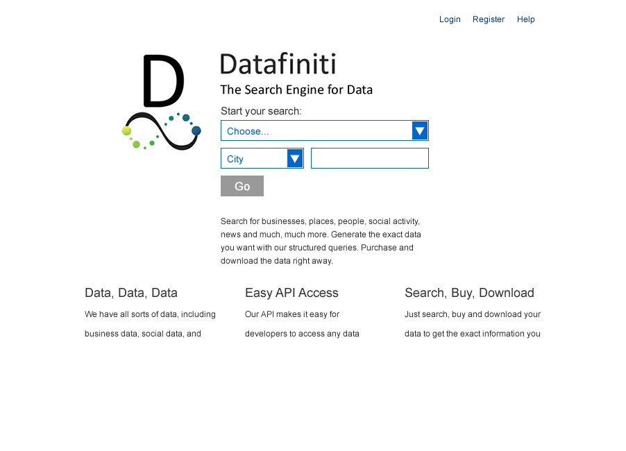
The first interface design was based on a common phrase I heard during the user interviews: “Make it like Google.” However, using natural language search techniques was beyond the Datafiniti development team’s capability. Instead, I chose to start the user off with a small set of search criteria, and then let the user continue to search, sort, and filter the data on the subsequent results screen. The response I got when reviewing these wireframes was negative. If users didn’t initially see the criteria they wanted to search by, they assumed the UI wouldn’t let them search on it at all.
Version 2
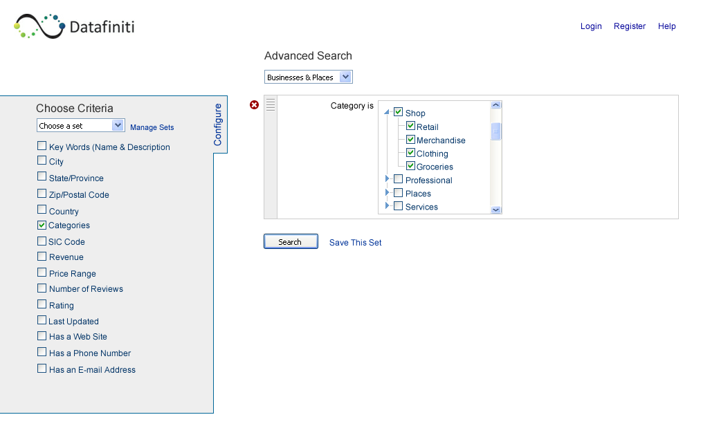
The second interface concept I designed was more complicated. The idea behind this concept was to allow users to create a database query. Users could choose a data type, then they could choose which criteria they wanted to search by, and finally enter values for the criteria. This interface concept also received fairly negative reviews from the group I reviewed it with. Some didn’t like that it started with a mostly blank screen, while others thought it was too complicated.
Version 3
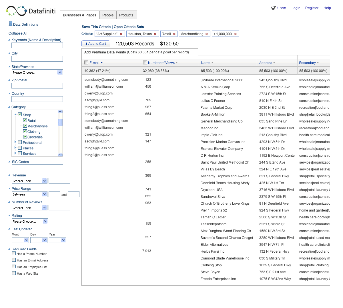
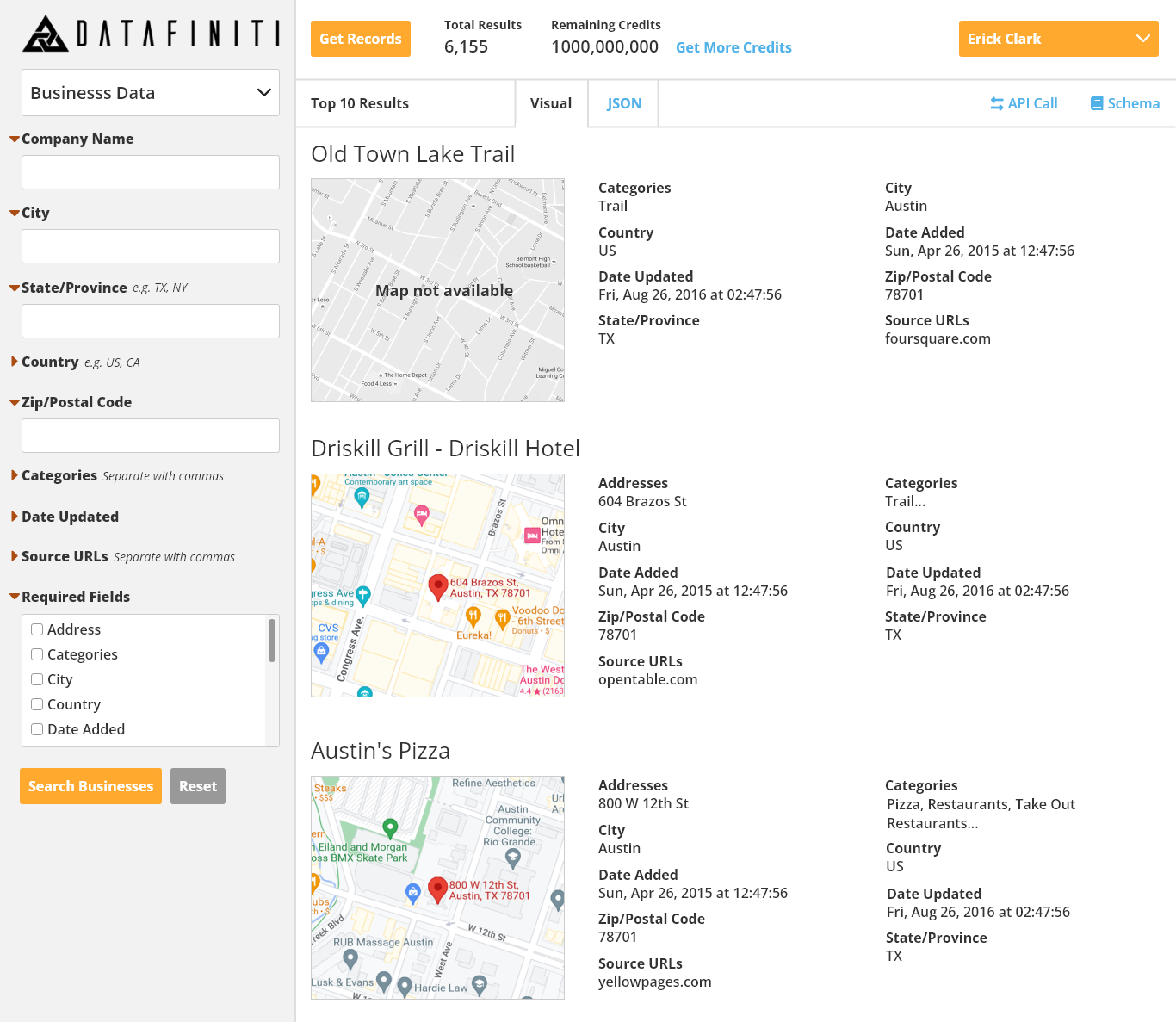
The last interface concept was actually the results screen from the first concept. This interface uses a common design pattern of having search criteria on the left and results in the main content area. This concept received the most positive response.
Finished Design
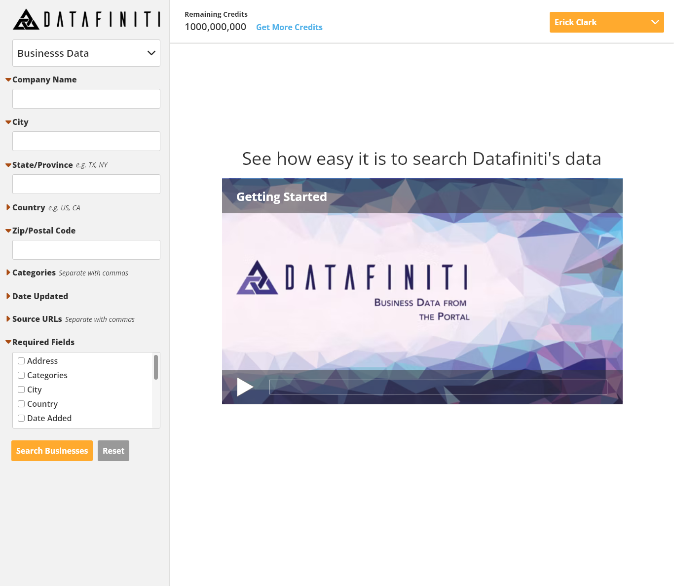
After reviewing the third design concept with Datafiniti's software developers and with the CEO, the design was simplified based on what was technically feasible and business requirements. The design for the search interface has gone through several revisions since it was first launched. Shown here is the most recent design I worked on.
