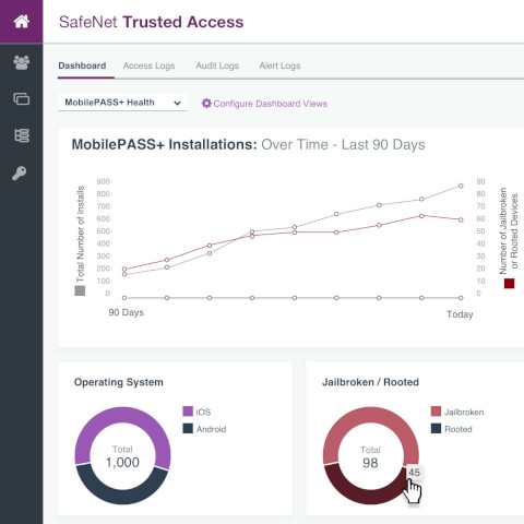
I worked as a lead UX designer on the Identity and Access Management team at Thales Gemalto. This team produced and maintained a cloud-based access management and authentication service called SafeNet Trusted Access. This software is used by IT administrators to control how and what employees could access inside a company network and set rules for multi-factor authentication. MobilePASS+ is the authenticator mobile app (similar to Google Authenticator or Duo Authenticator) used with SafeNet Trusted Access.
My Role
I worked as the designer on this project. The process of designing these screens was iterative and involved discussions with the product owner followed by several reviews with him, other stakeholders, and members of the design team.
Project Goals
The MobilePASS+ authenticator mobile app collects key information about the devices it's installed on for security purposes. This information includes OS type and version and whether the OS has been jail-broken or rooted. Mobile devices that are jail-broken or rooted might allow hackers to compromise the integrity of the app and those devices are also more susceptible to malware and viruses. Though the data was collected by the app it was not sent back to SafeNet Trusted Access. The app was updated to change that, and additional screens needed to be added to SafeNet Trusted Access to display that information.
The use cases that needed to be addressed in the new screens were:- The IT admin needs to know high level information about the number and type of mobile devices on the company network, so they know how many resources to devote to supporting those devices.
- The IT admin also needs to know the number of jail-broken or rooted devices on the company network, so the admin has a general view of the security of the network as it pertains to mobile devices.
- The IT admin also needs to be able to view information about individual users and devices to determine if MobilePASS+ should be disabled or suspended on a device.
Research
Normally I would have conducted customer interviews to better understand the problems this project was attempting to solve, but I don't always have the luxury to do that due to time constraints. For this project I relied on the product owner's and internal SME's knowledge of the customers' wants and needs.
Process Flows
Shown below are high level process flows that show how the four established personas (End User, Help Desk, Chief Information Security Office (CISO) and the Product Owner) would interact with the planned updates to MobilePASS+ and SafeNet Trusted Access. The dashboard screens shown in this document apply largely to the process flows for the CISO and Product Owner.
Initial Designs
Leveraging Safenet's design system, my initial solution was to create a dashboard system. SafeNet Trusted Access has a single high-level dashboard that shows login activity. I added a menu to the top of the dashboard screen that would allow users to switch between the existing dashboard and the new MobilePASS+ Health dashboard. The information shown on the first screen provides some context about app installations over time along with OS and jail-broken or rooted status. The purpose of this information is to give IT admins a view of the overall health of the mobile devices on their network. The column on the right shows most recently active users with jail-broken or rooted devices for the purpose of troubleshooting users who are having trouble logging in.
Final Design
This design concept presented the user with high level stats about the mobile devices on the customer's network while also showing granular data about the devices and their users. This made the information more actionable in terms of disabling or suspending an individual's app. I added search and filtering functionality and an option to export the data for use with mass email (to request that users un-jailbreak or un-root their phone.) After reviewing each design concept with stakeholders, members of the design team and members of the software development team, this design was chosen to move forward with.


